A family reunited
It’s a new dawn and a new era rising for the bank industry in Norway. It’s more important than ever to gain customers' trust, loyalty and show excellence in products and services. While at the same time, brands are assessed to a much greater extent according to how they contribute to a sustainable future.
Deliveries
Brand strategy
Brand positioning
Brand architecture
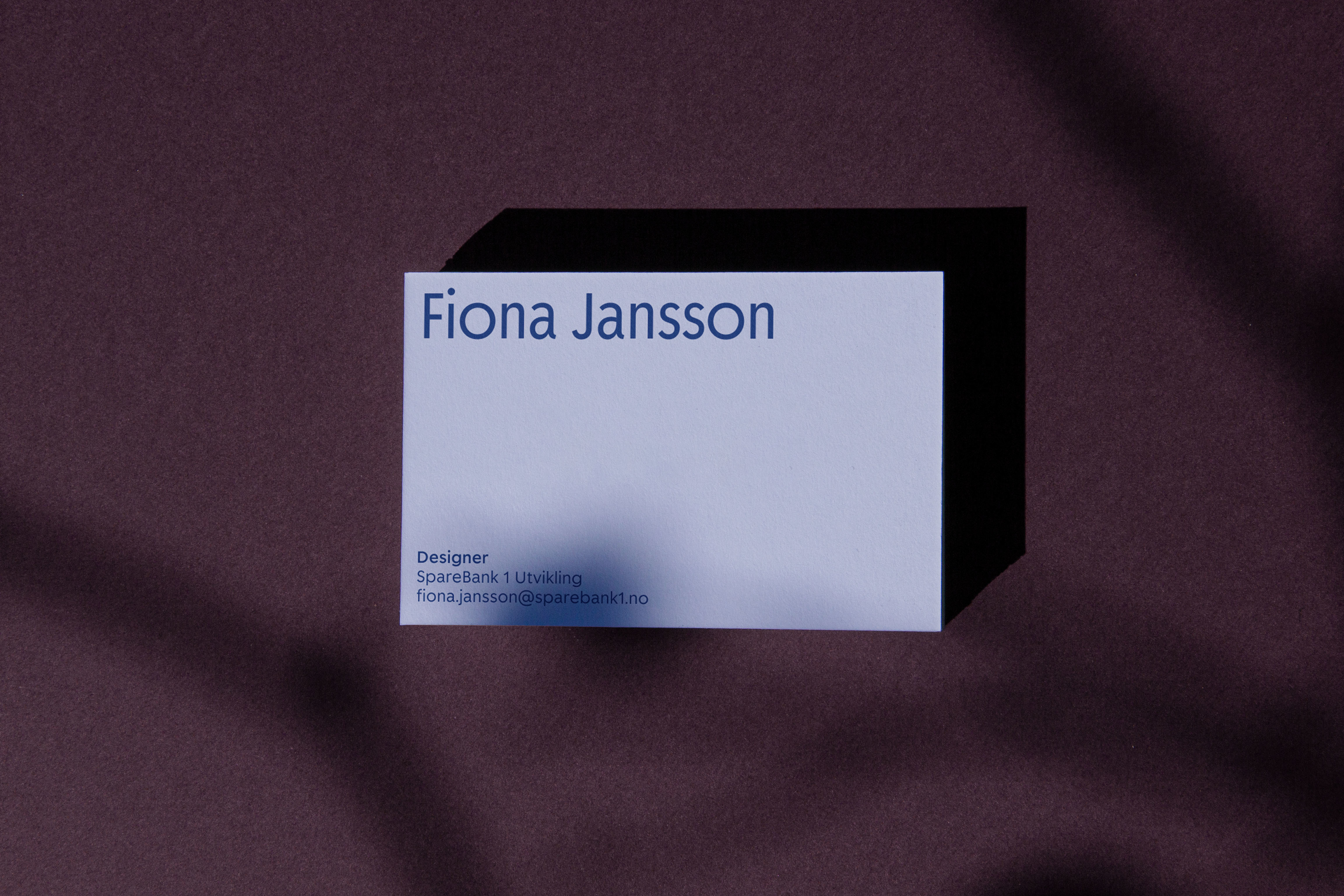
Brand identity
Motion design
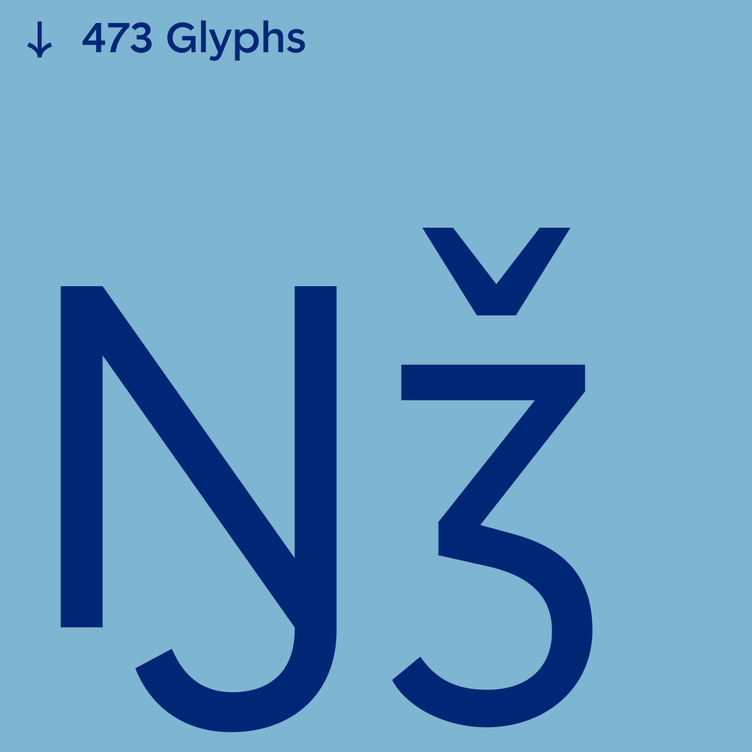
Type design
Illustration
Environmental
Editorial

SpareBank 1 has a well established logo, and is especially recognised by the strong red circle enclosing the number 1 in their logo mark. When adjusting the visual identity, the circle became an integral part of their new visual language.
A familiar tale told with a new voice

We developed a bespoke typeface built on a geometric circular language. The font, with it's playful and warm characters, builds a strong and recognizable voice for SpareBank 1.
A natural colour palette inspired by the local communities
Each colour originates from the Norwegian nature and local communities.


.png)
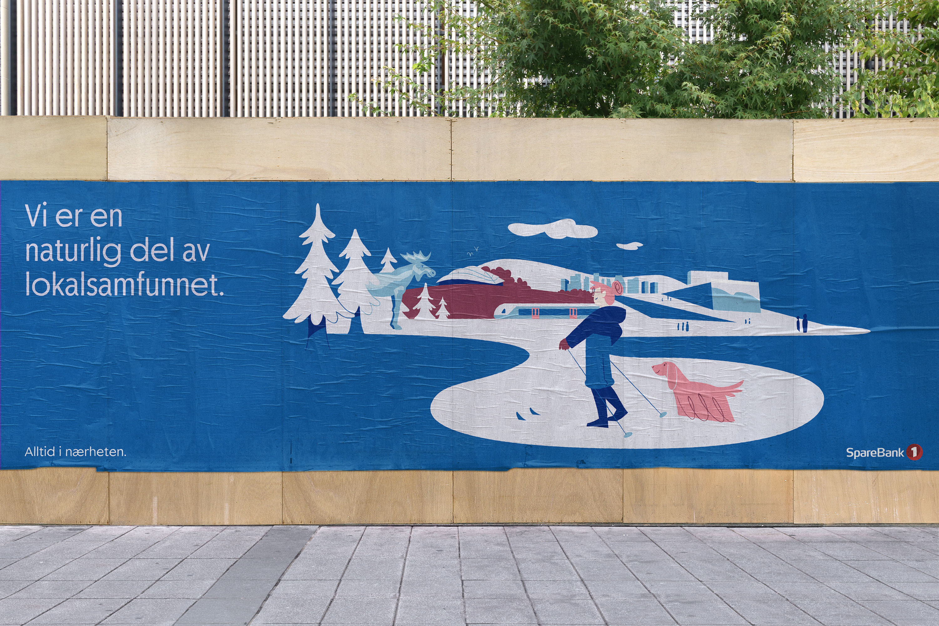
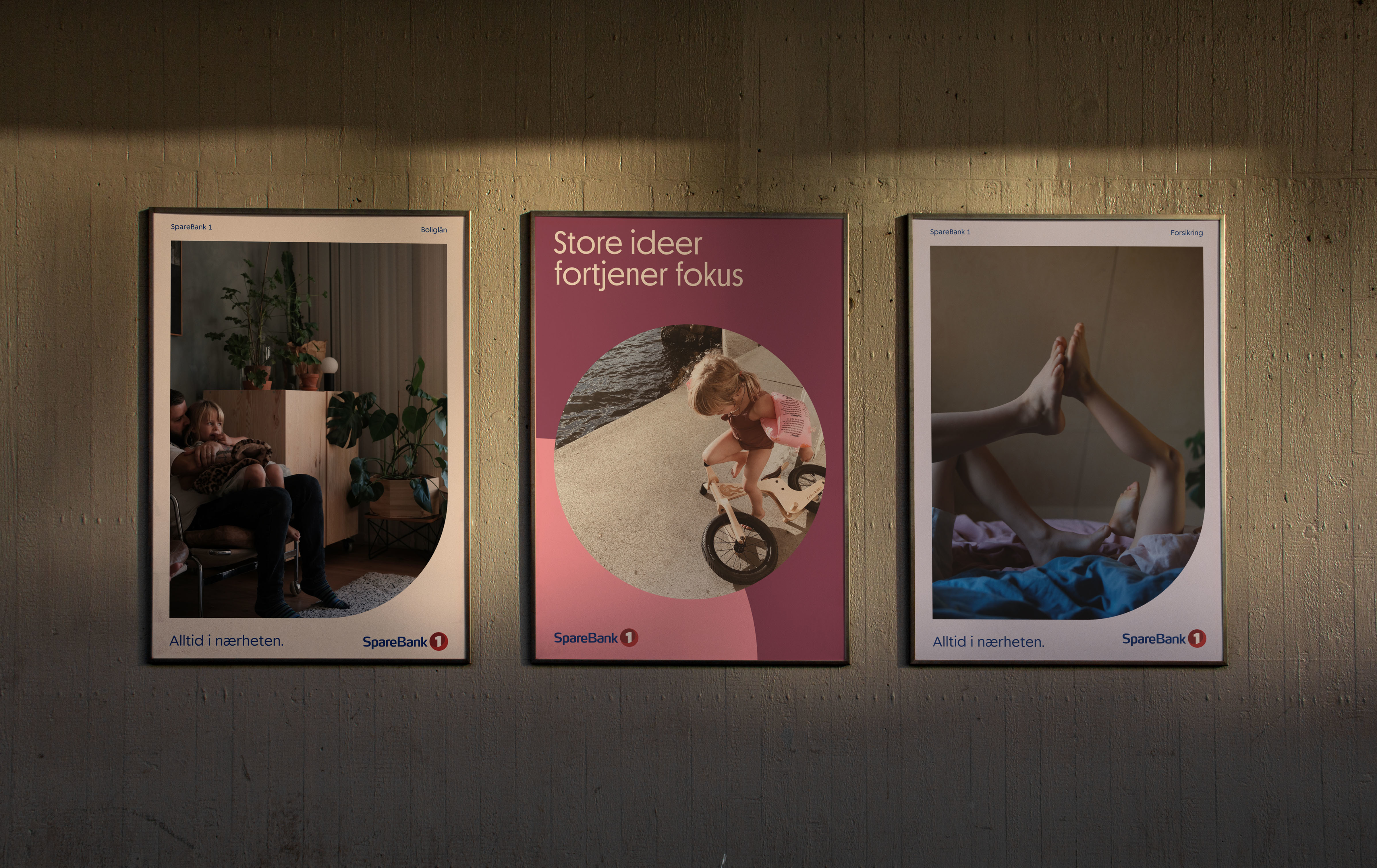
The brand imagery aims to capture the neighbourhood spirit nationwide
.jpg)
.jpg)


.jpg)
.jpg)