Following theiracquisition by DNV, we worked closely with the MBI Health team to help themrefresh their positioning and identity, as well as creating a no-nonsensepersonality for a brand that strives to take responsibility for one of the NHSbiggest challenges – optimising patient pathways for +50M patients in the UK.
Our new direction –Right time. Right place. Right Treatment. – allowed us to better segment theirmessaging based on the three key stakeholder groups that form their keyaudience; the Trusts which manage the hospitals, the clinicians who needpatient data to be as accurate as possible, and the patients who wish to betaken care of as early as possible.
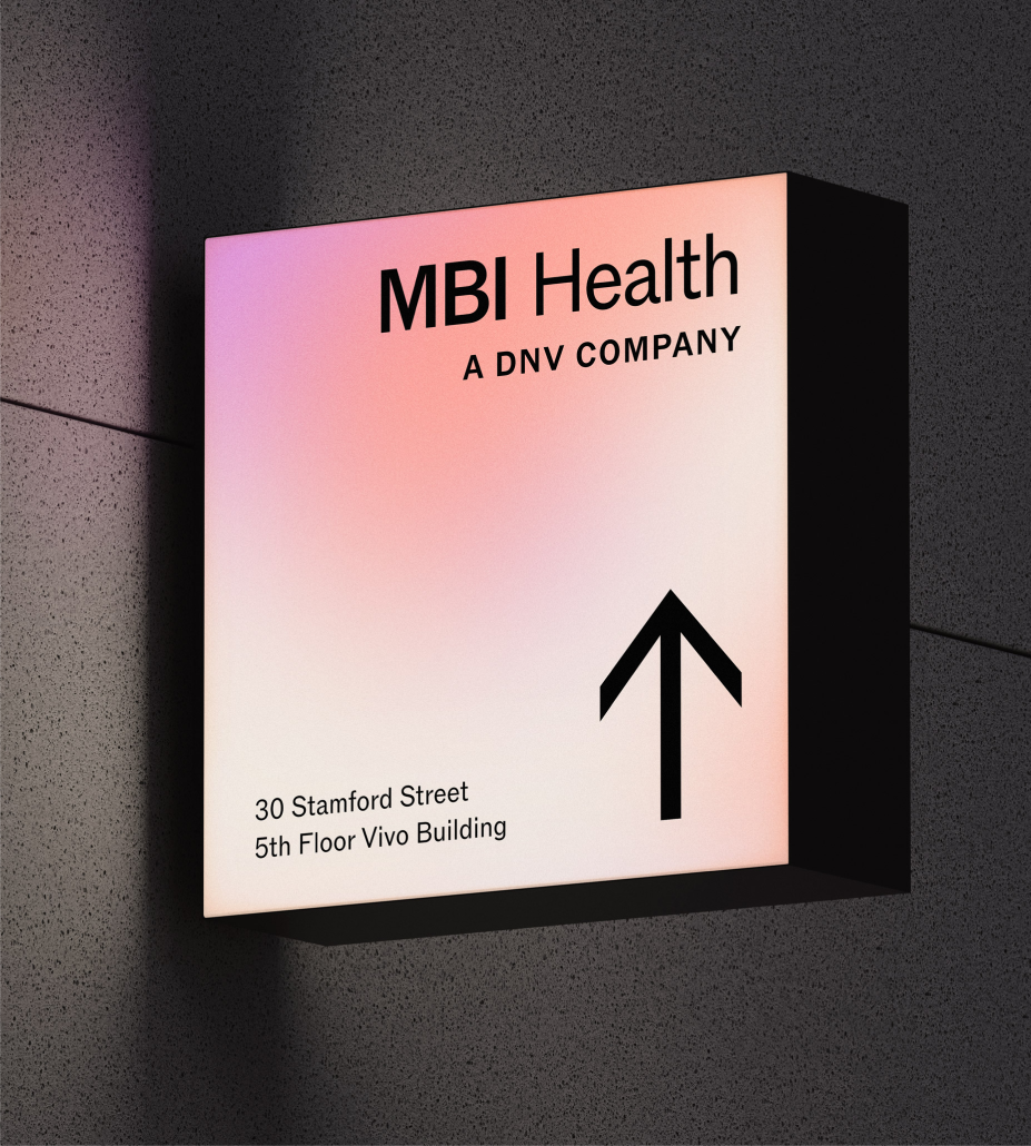
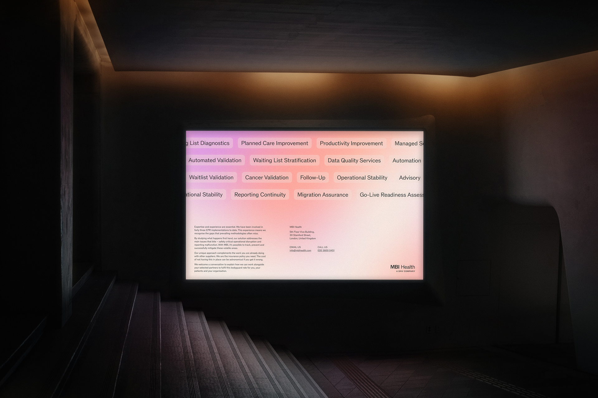
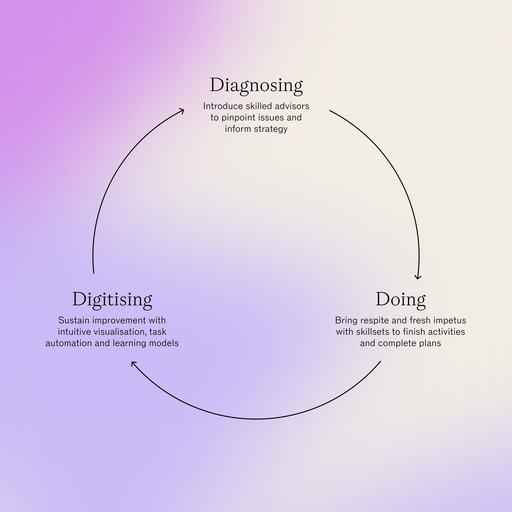
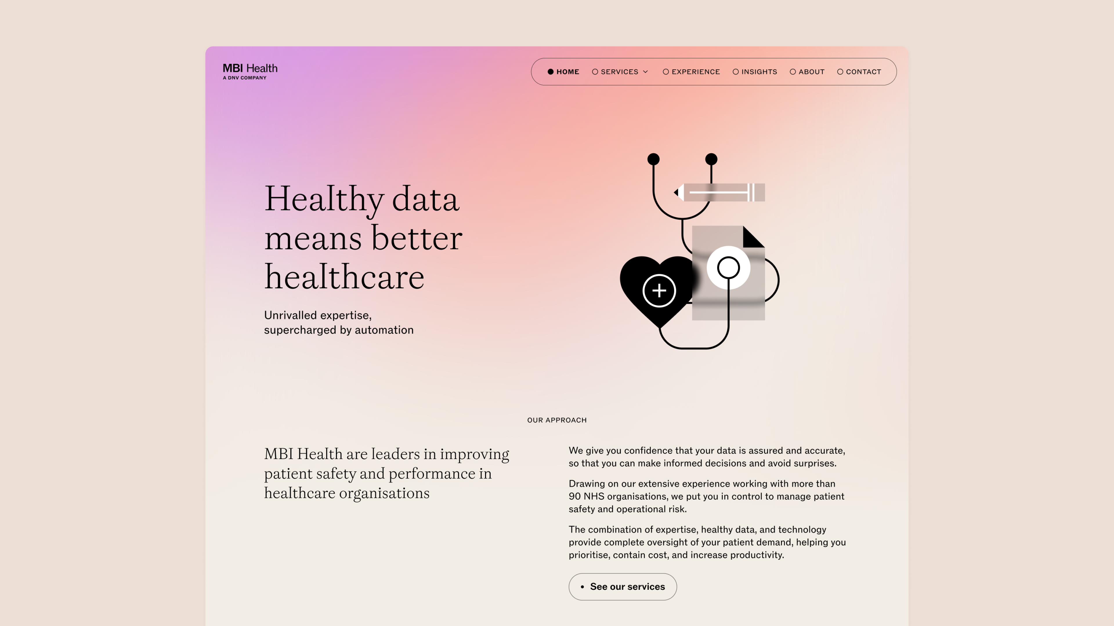
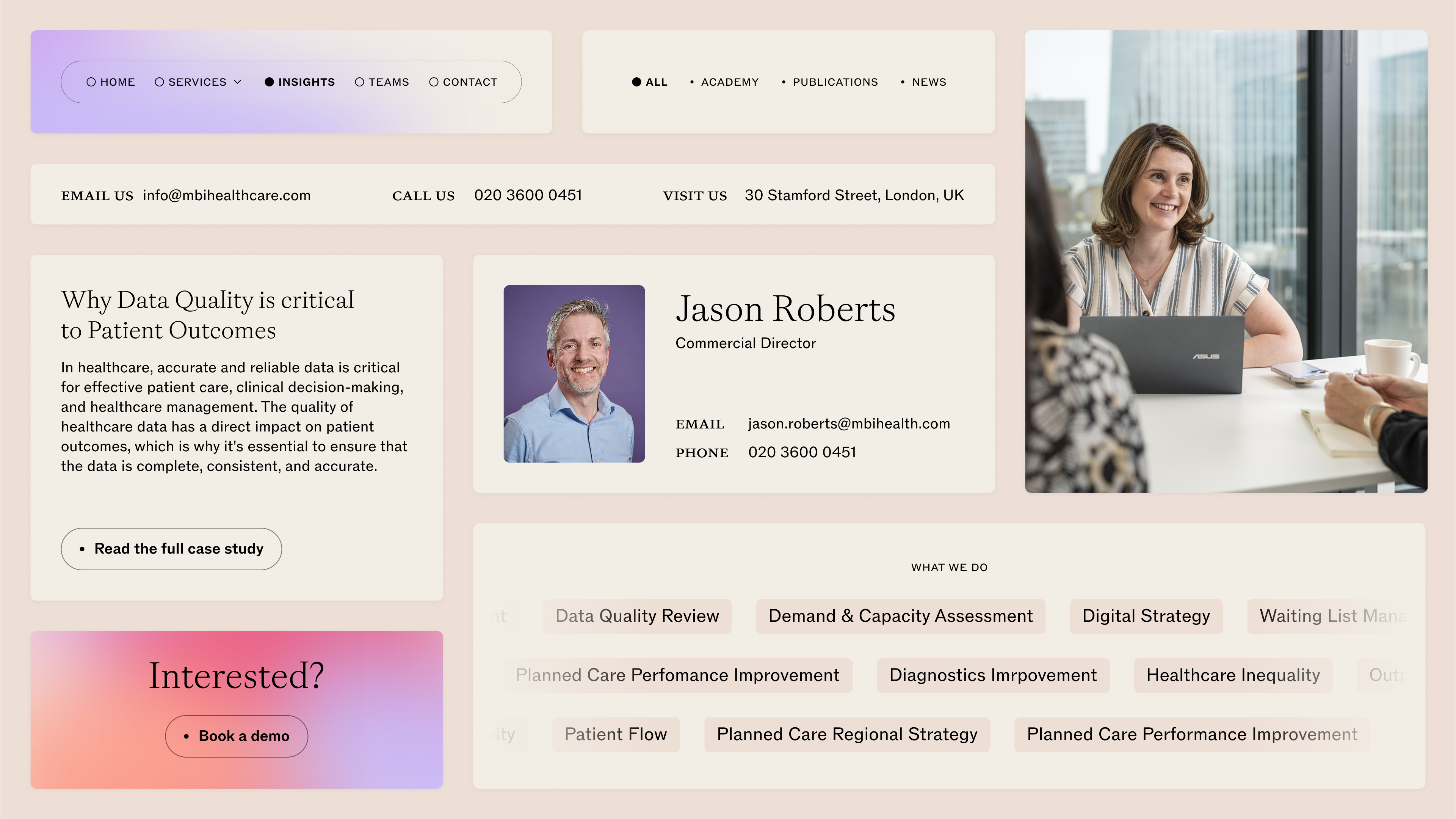
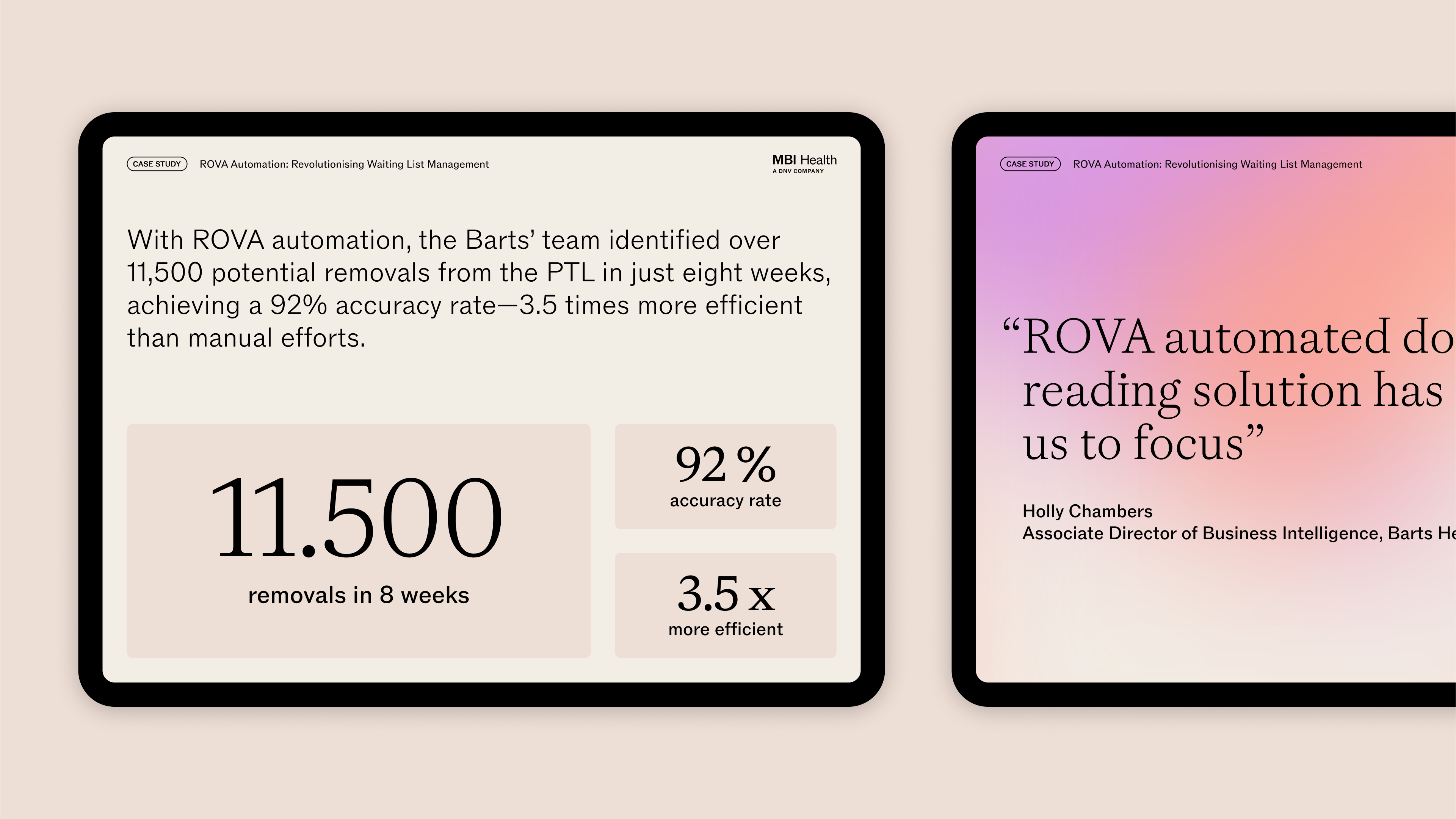
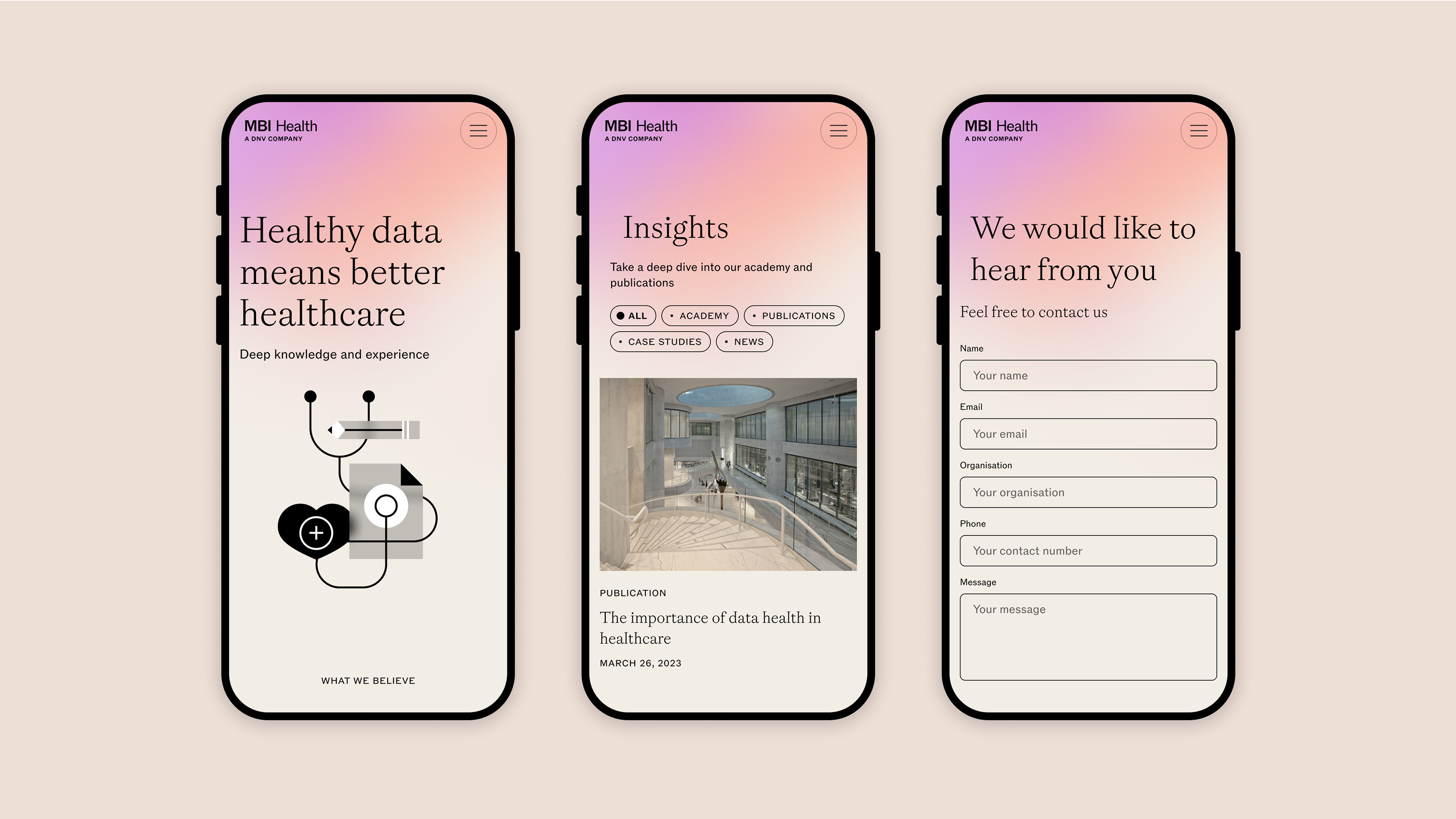
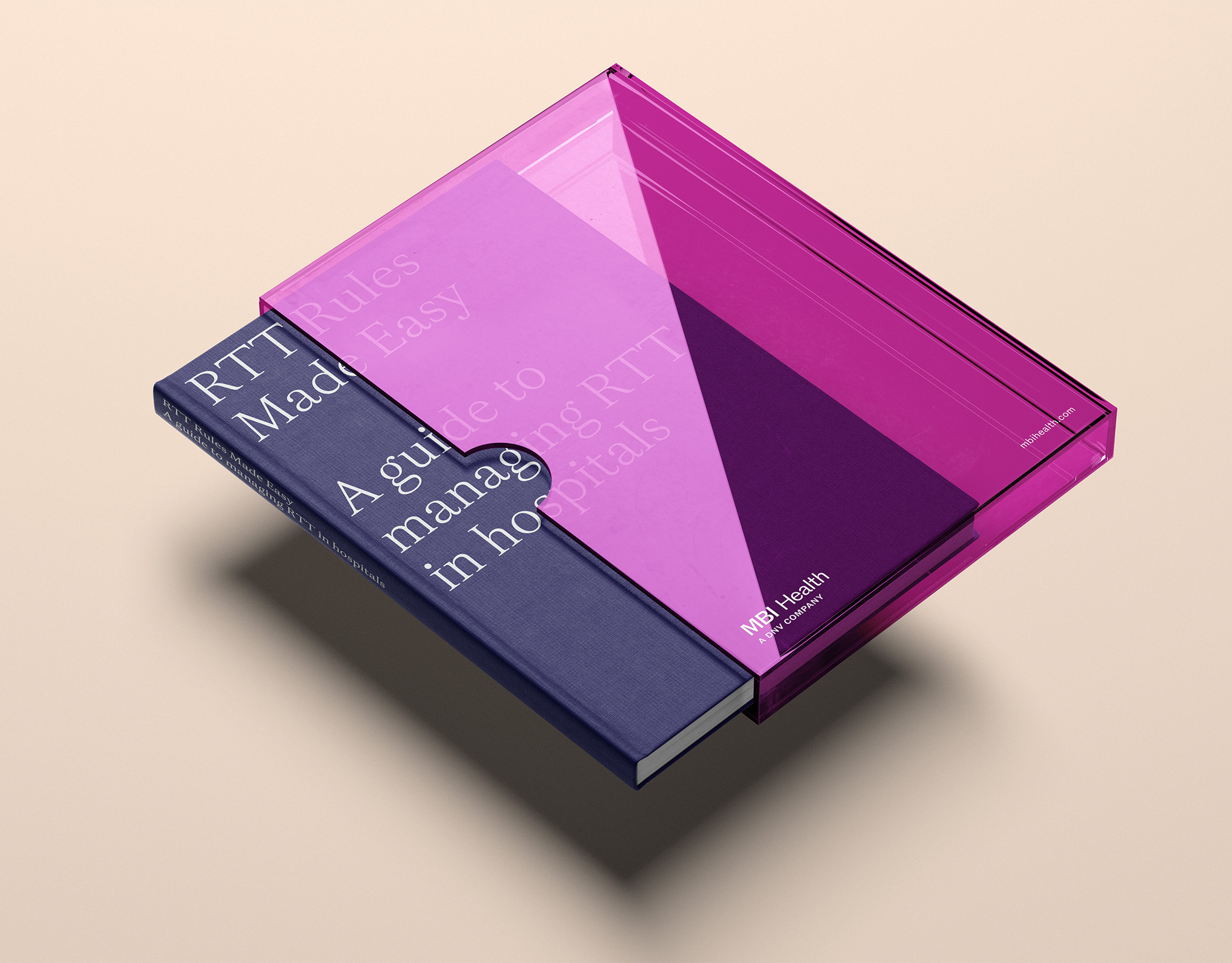
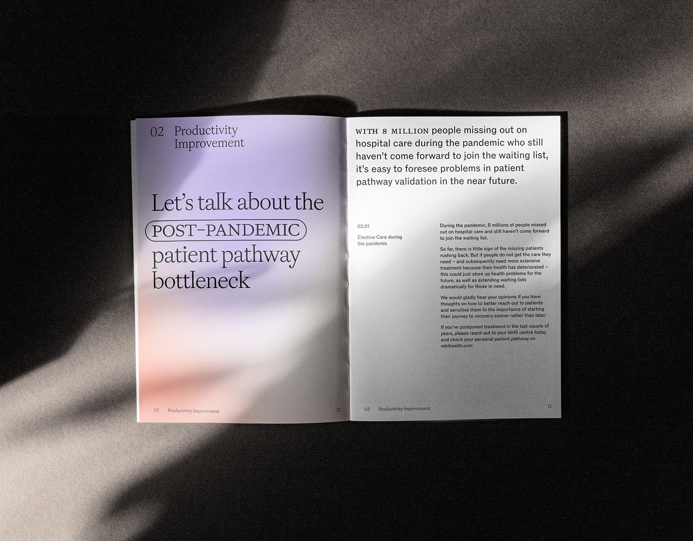
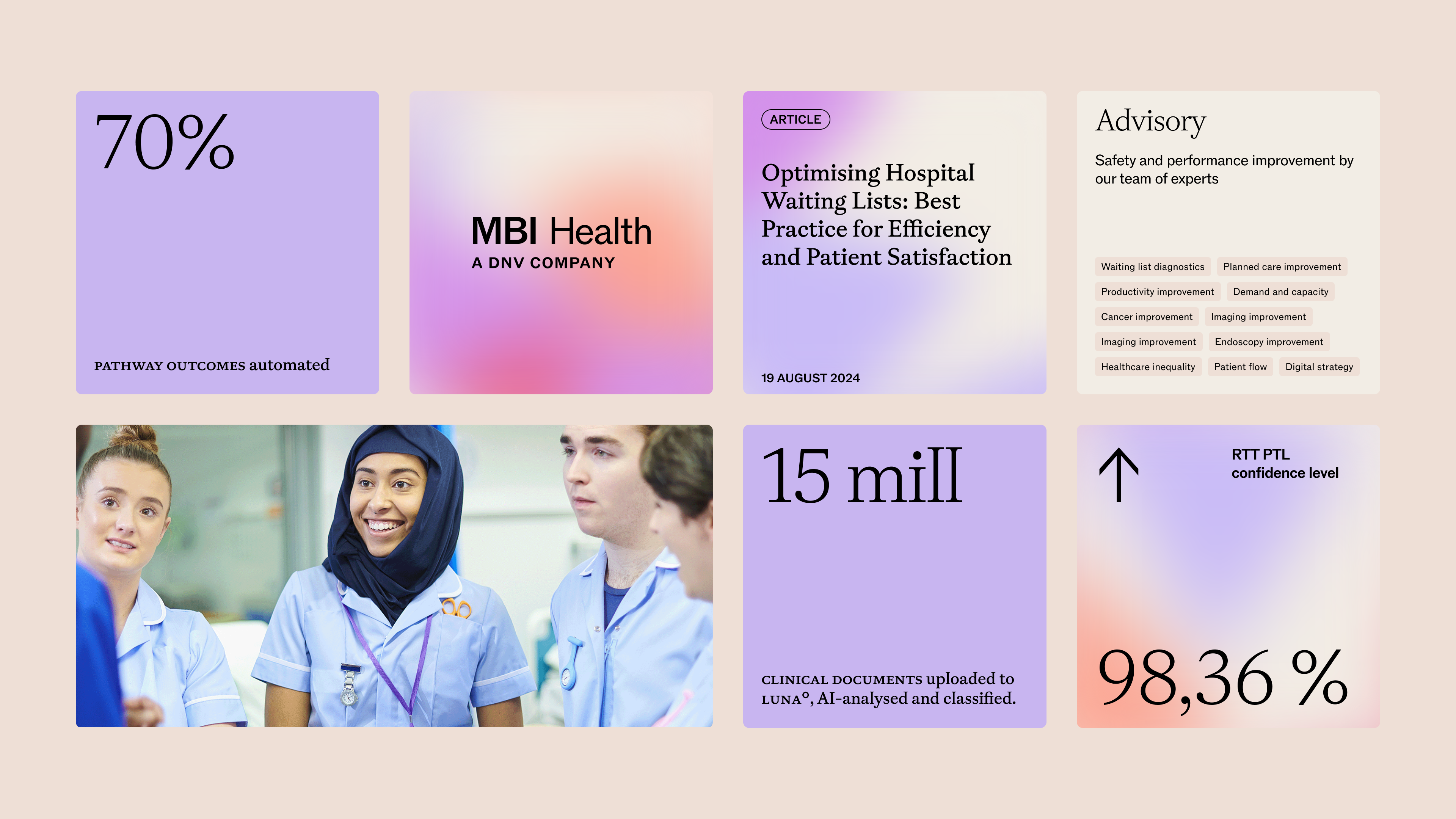
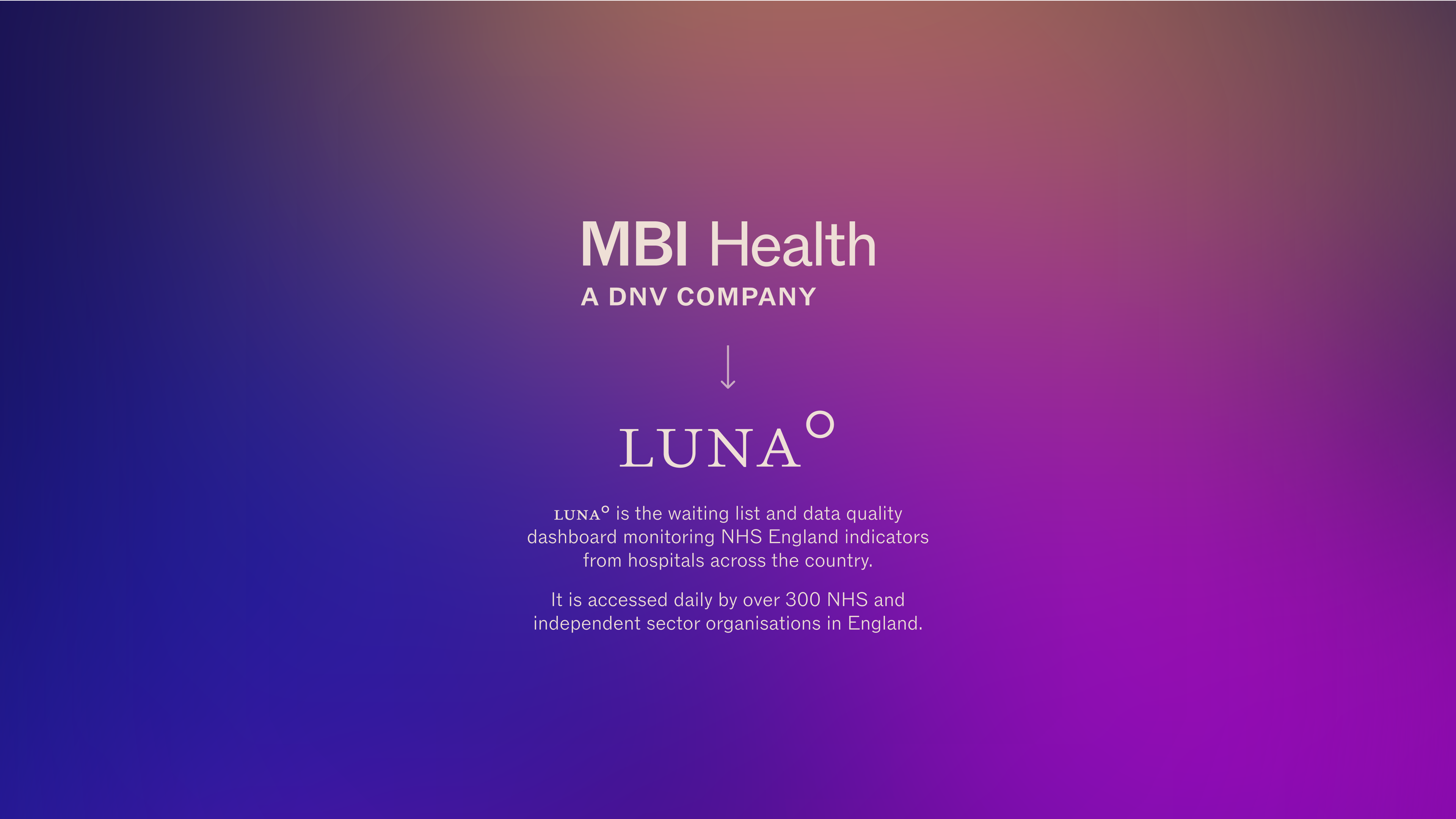
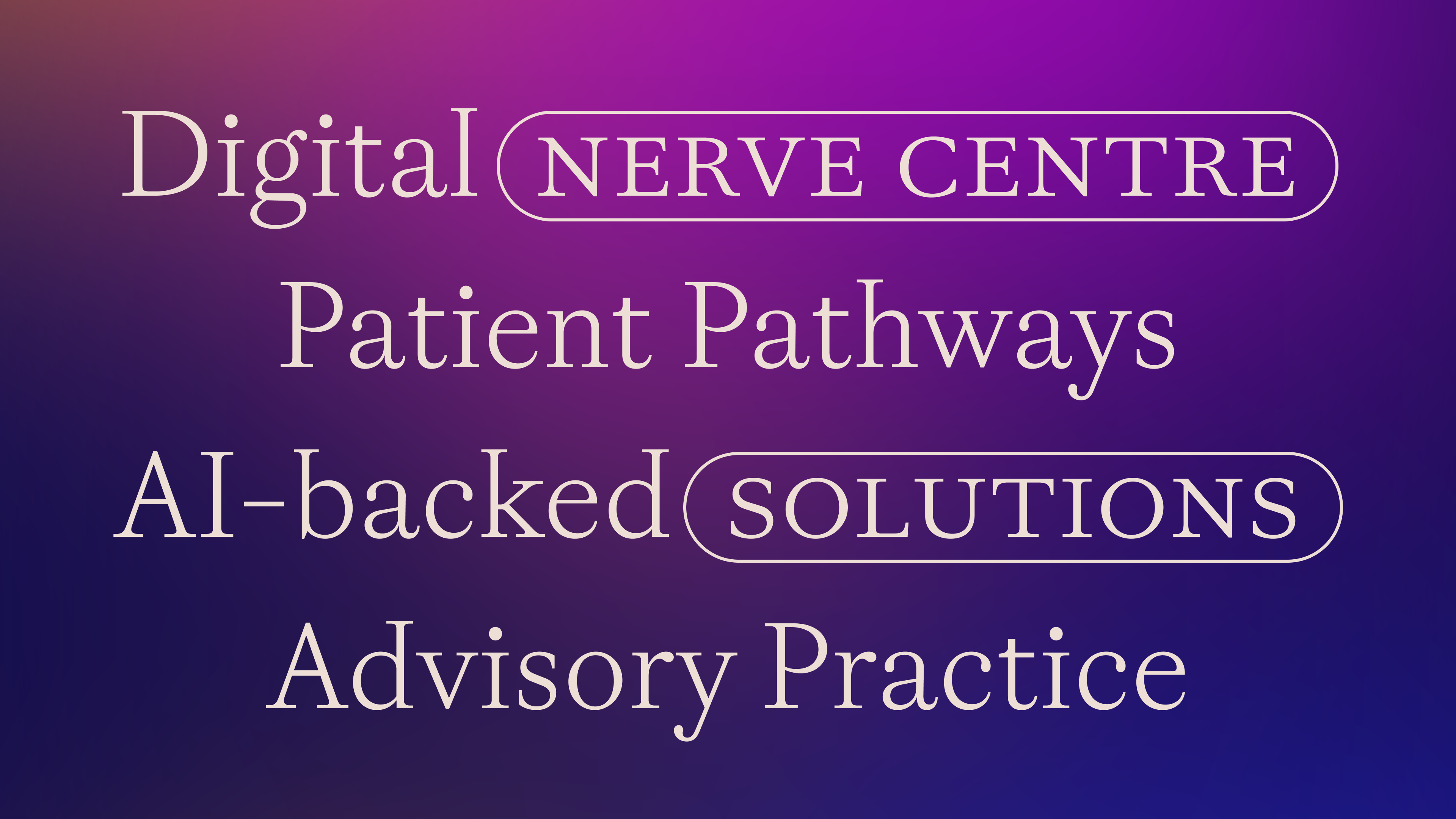
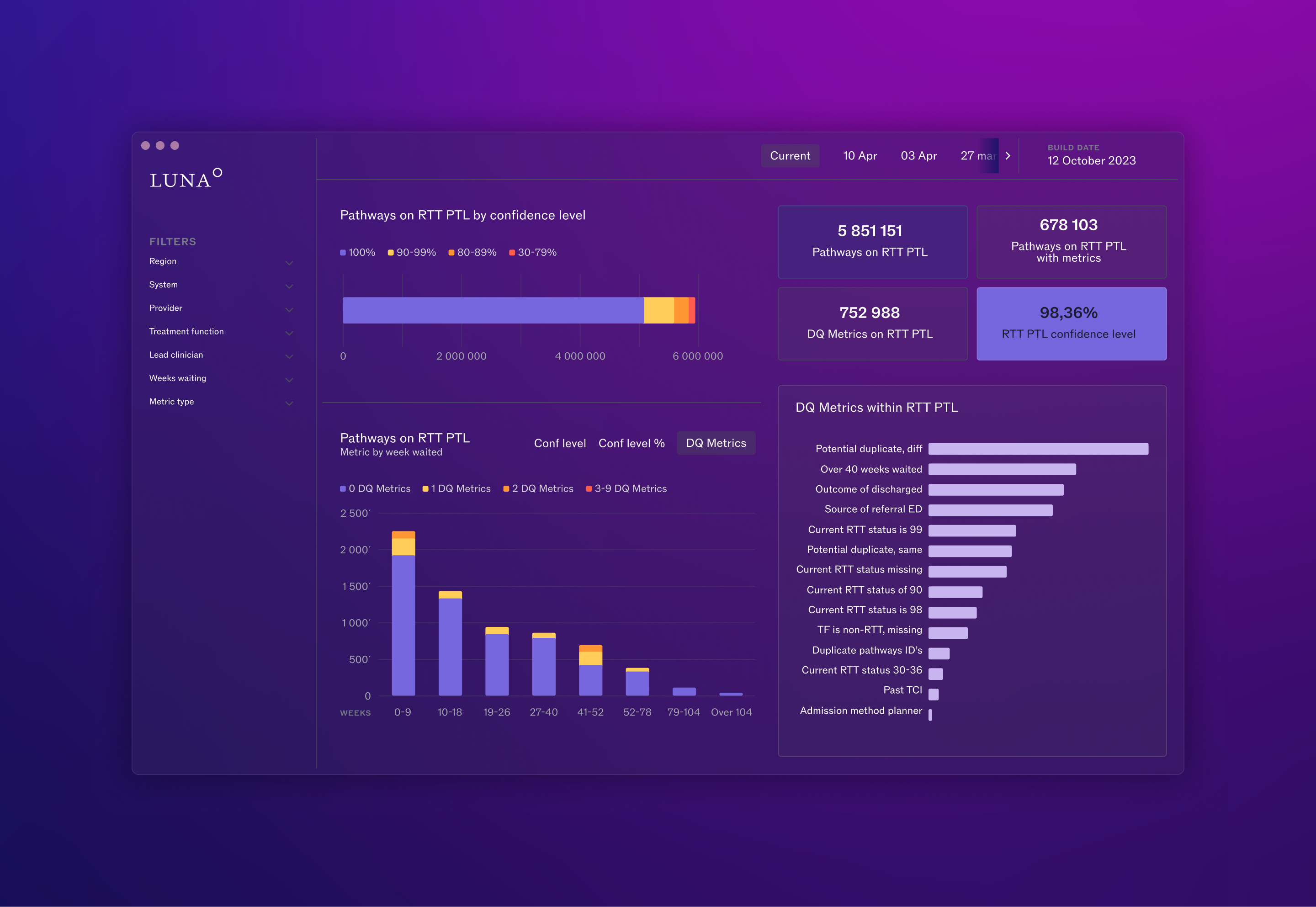
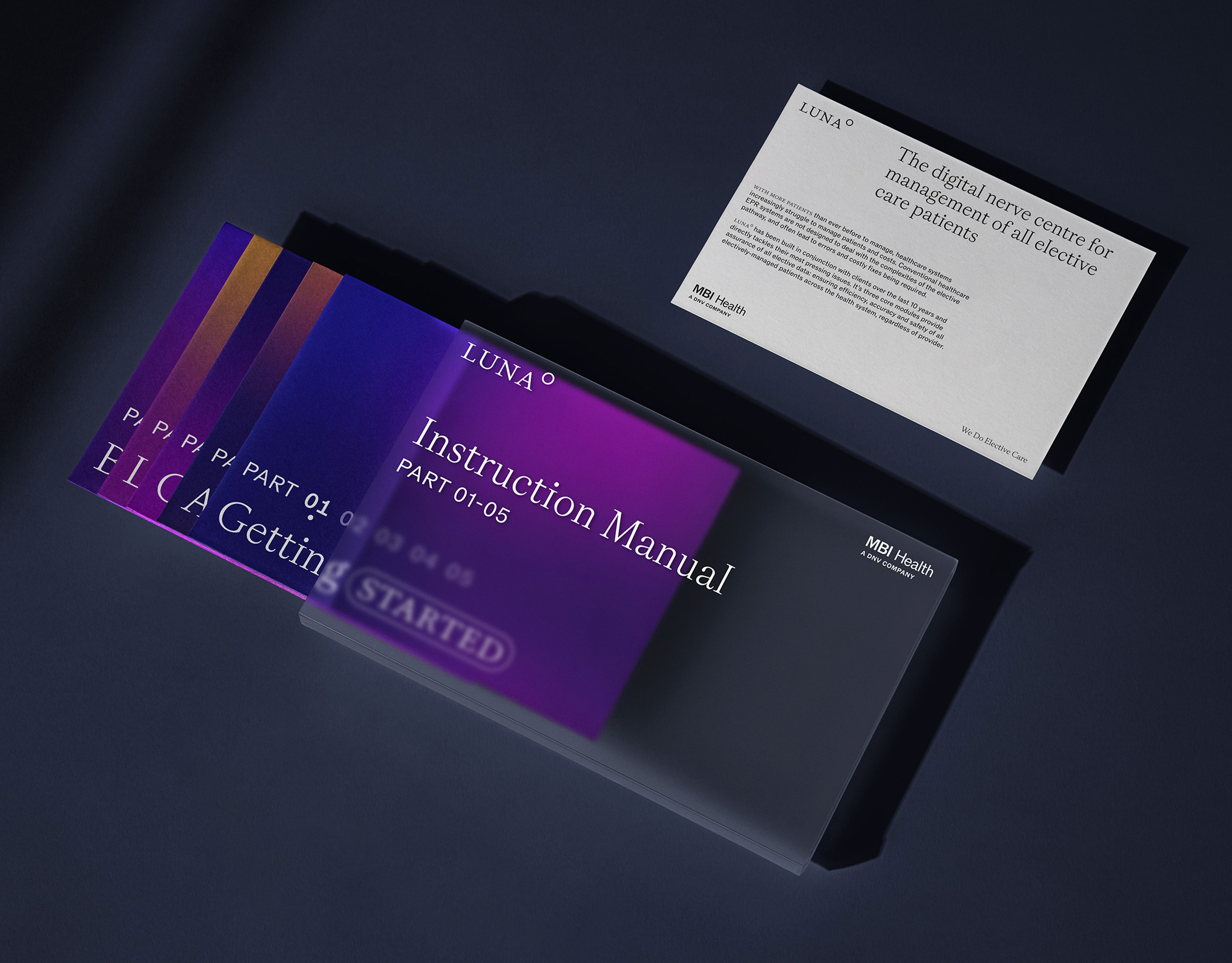
The brand we createdfor MBI is based on a dynamic gradient that dramatises the straight-talkingbehaviour of the company. The gradient, which is ever-present, goes from alively orange-pink hue when talking about the company’s service and mission,and shifts to a purple-blue hue when talking about Luna or Rova, the AI techthat powers the entirety of MBI Health’s systems.
Our typographic systemcombines a butterfly serif and a grotesk font in a unique way, associated withUI elements that help make the messaging both print and digitally-native.
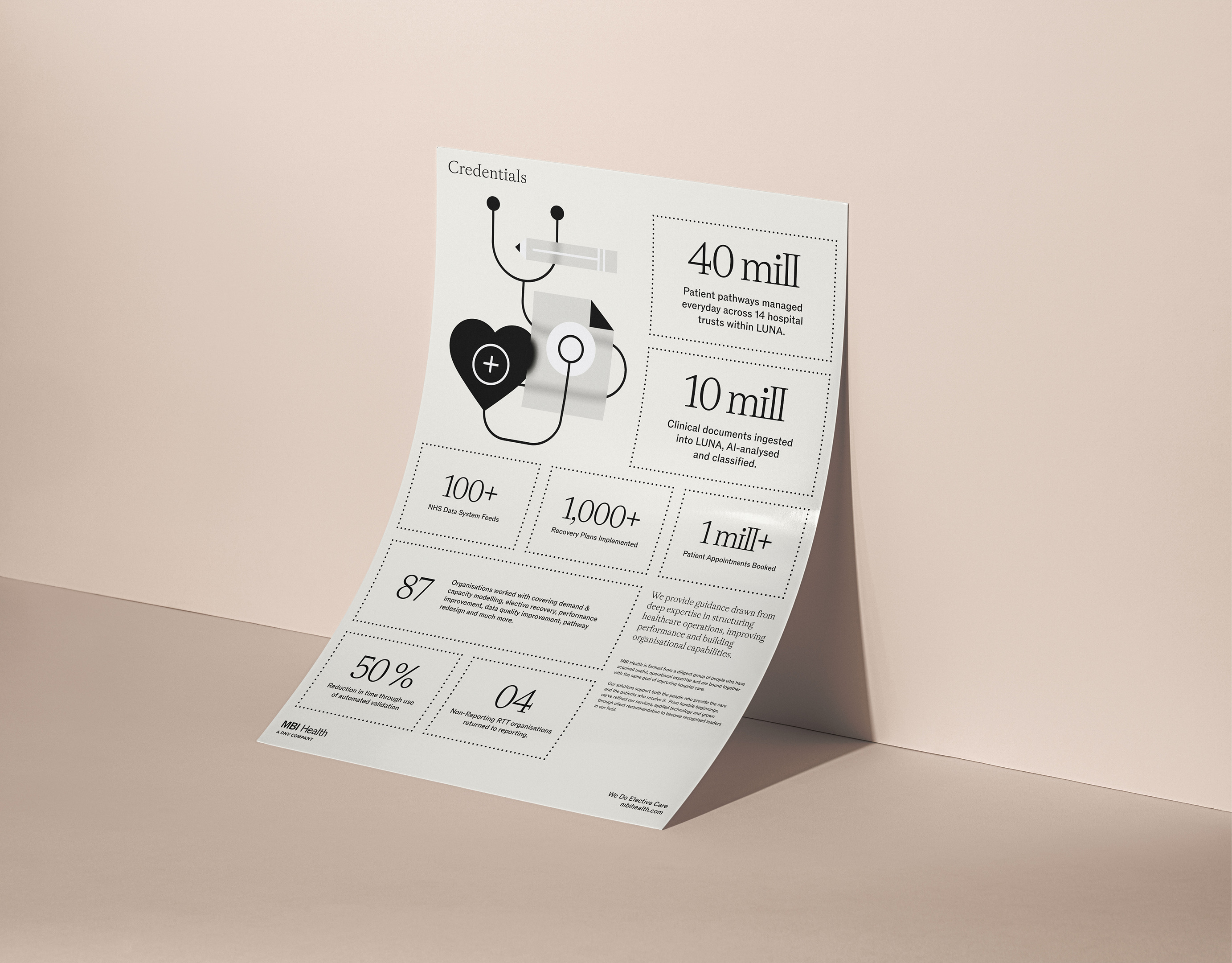
Finally, thesemi-abstract illustration style we developed aimed to dramatise pathwaysthrough the use of a seamless line defining various recognisable elements fromthe healthcare world, peppered by areas of blur that emphasise the challengesof transparency and unknown often found in ever-changing data sets.
The combination of allthese elements was perceived as a singular and effective answer to turning MBIHealth into Healtcare’s Data-Health Specialists, as well as setting the companyup as a unique contender in their own field of expertise and future-proofingtheir communication needs.