Shaping the future of insurance
Deliveries
Brand strategy
Brand positioning
Brand Experience
Brand identity
Sound design
Motion design
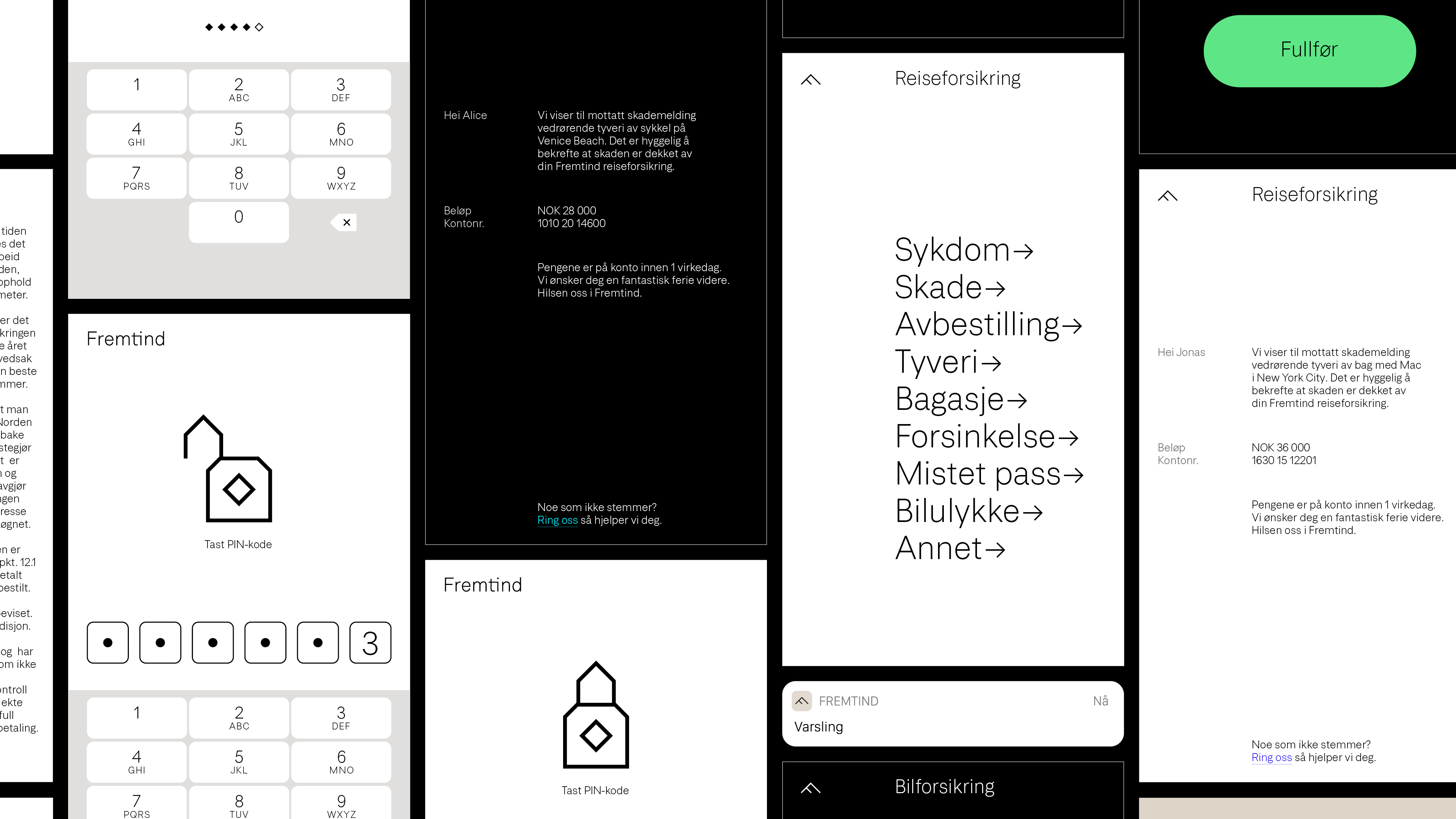
UX/UI Design
Type design

The dynamic logo system is the bedrock of Fremtind’s new visual identity
Fremtind Grotesk
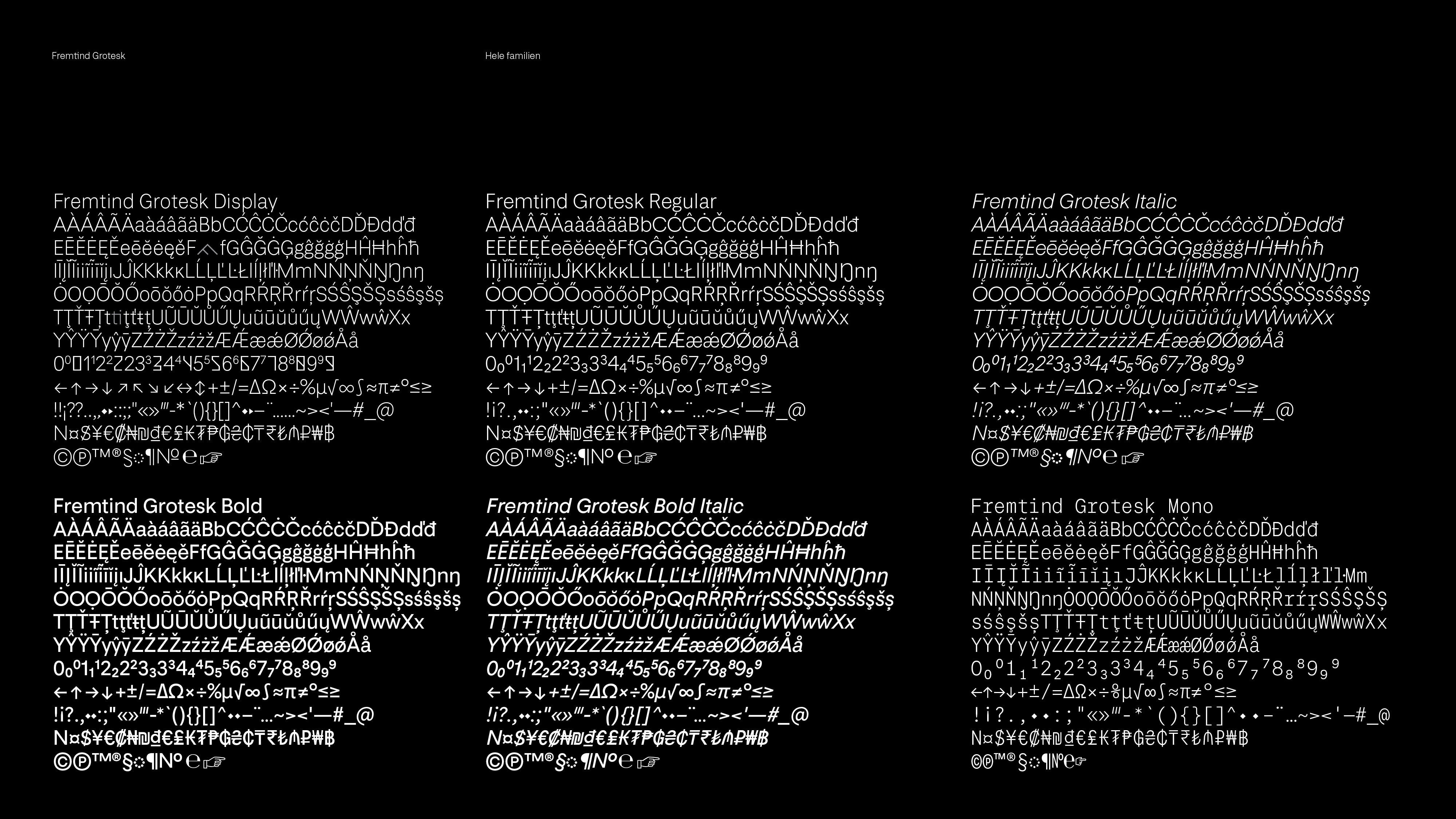
Neutrality and flexibility are key concepts for Fremtind Grotesk. This makes the identity flexible enough to work with both DNB and Sparebank1. The font comes in a series of complementary faces: the Display style is for big use; the Text styles are for any and all running text; finally, the Mono style is for tables.
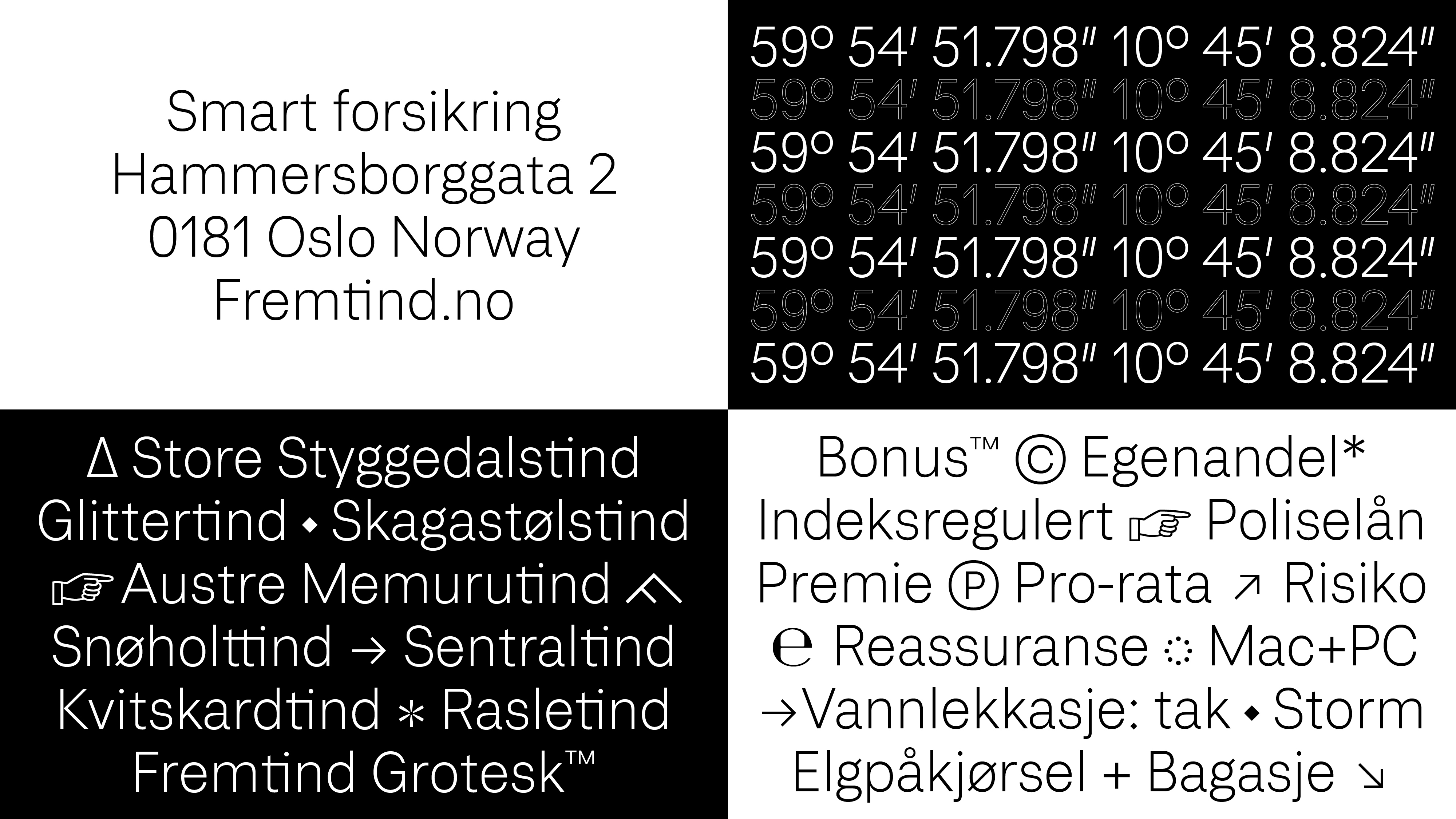
Fremtind's colors are inspried by the pristine Norwegian mountains. The primary colors are supported by a high contrast color scheme for accessibility
.jpg)


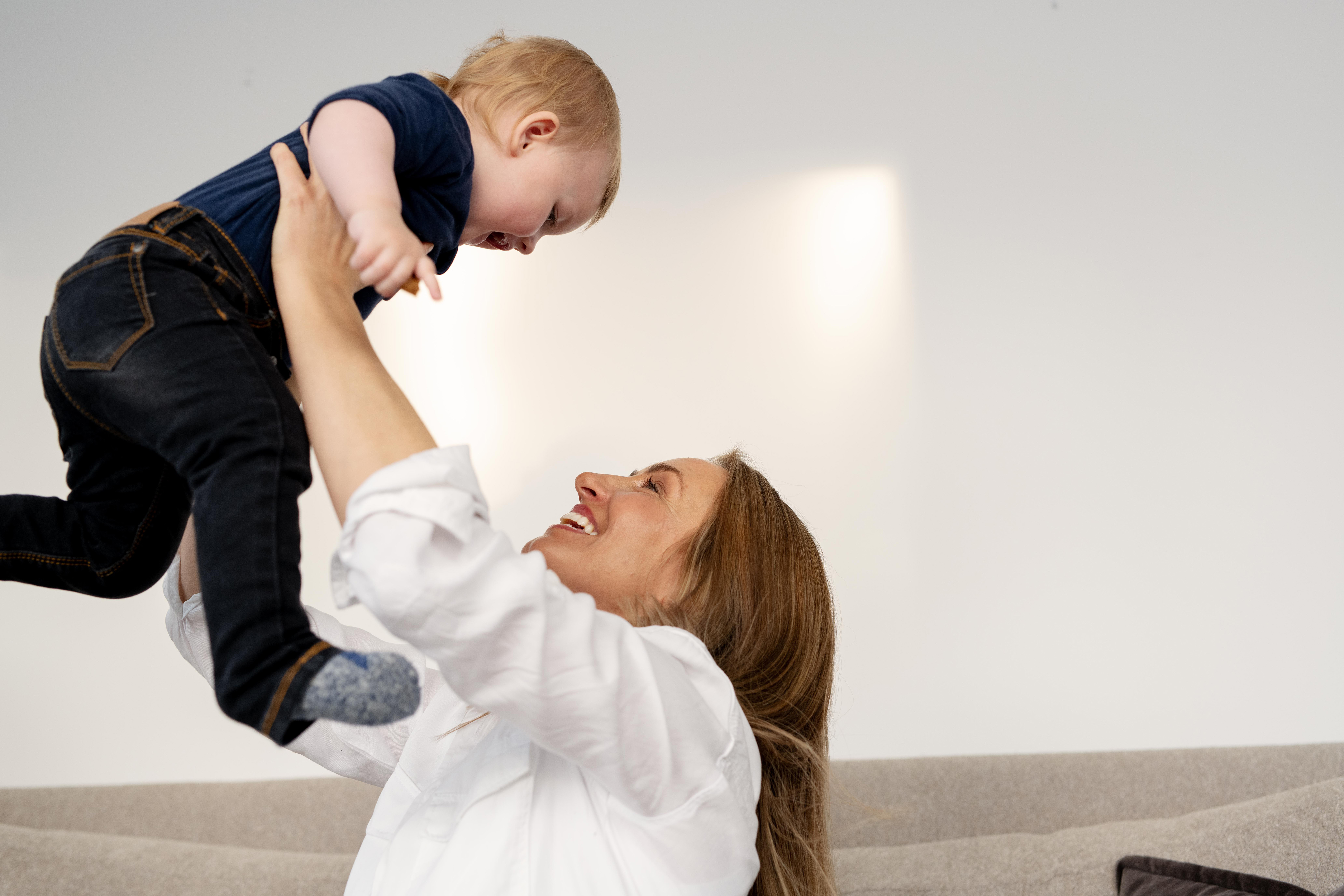
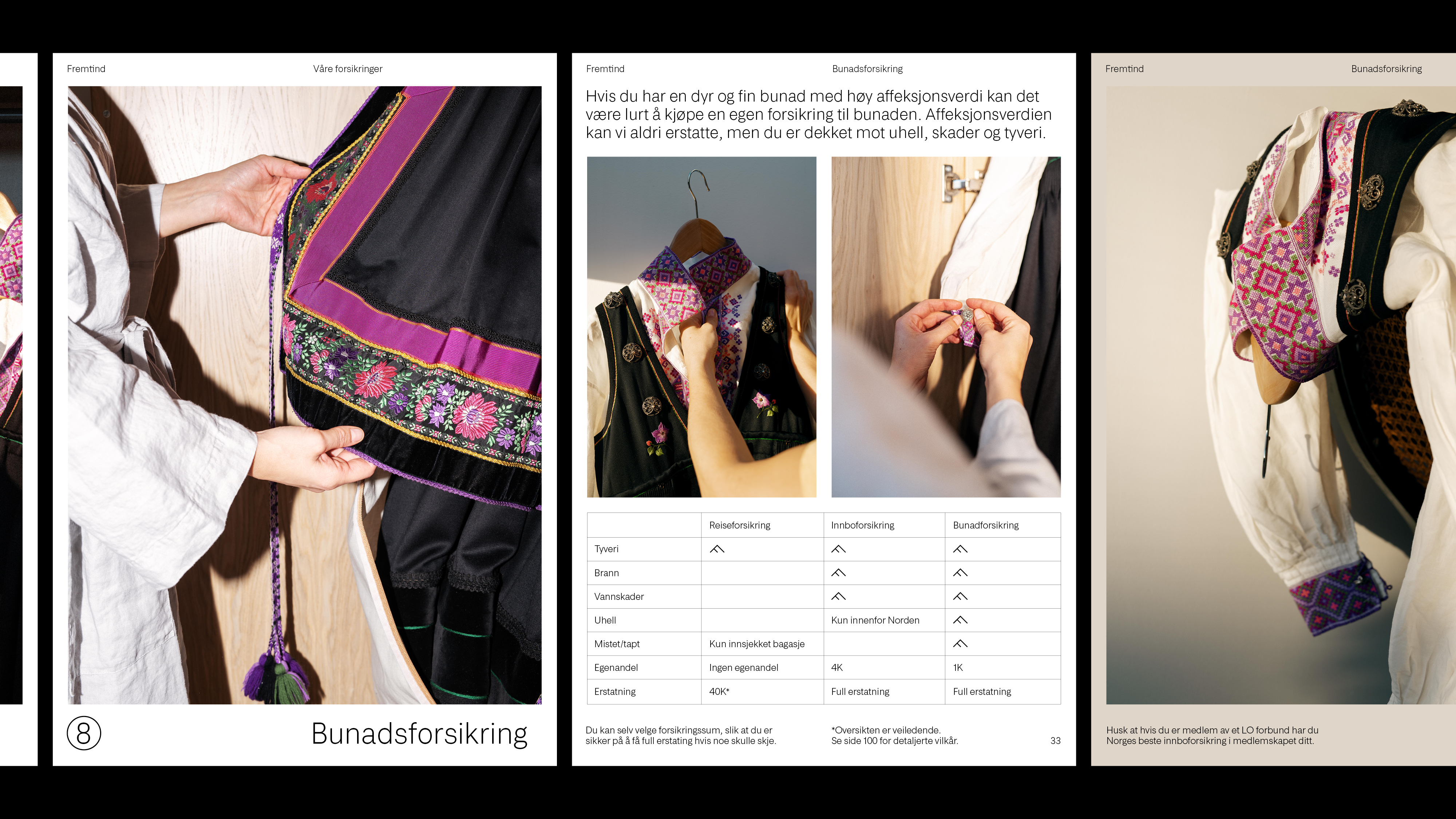
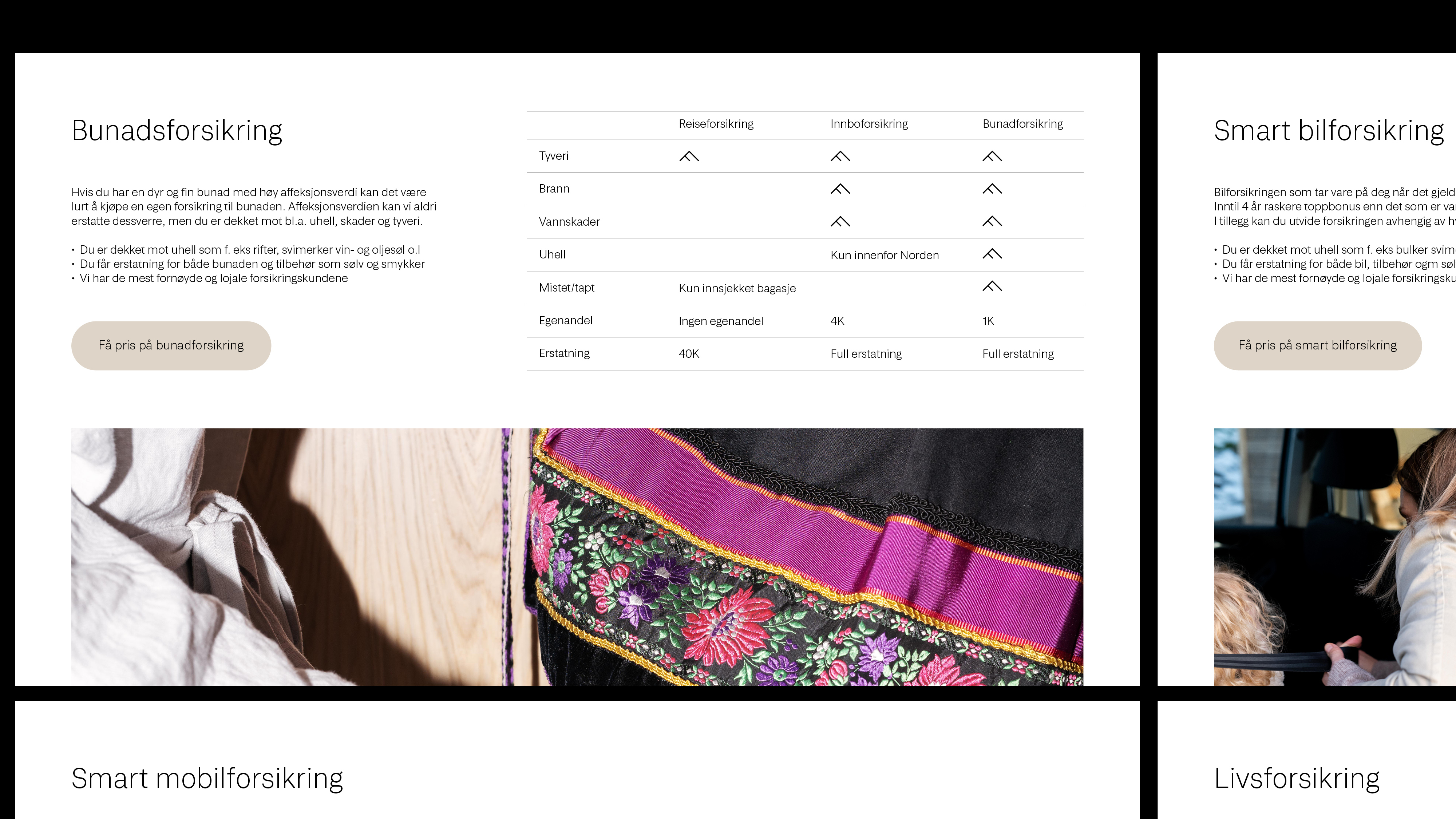
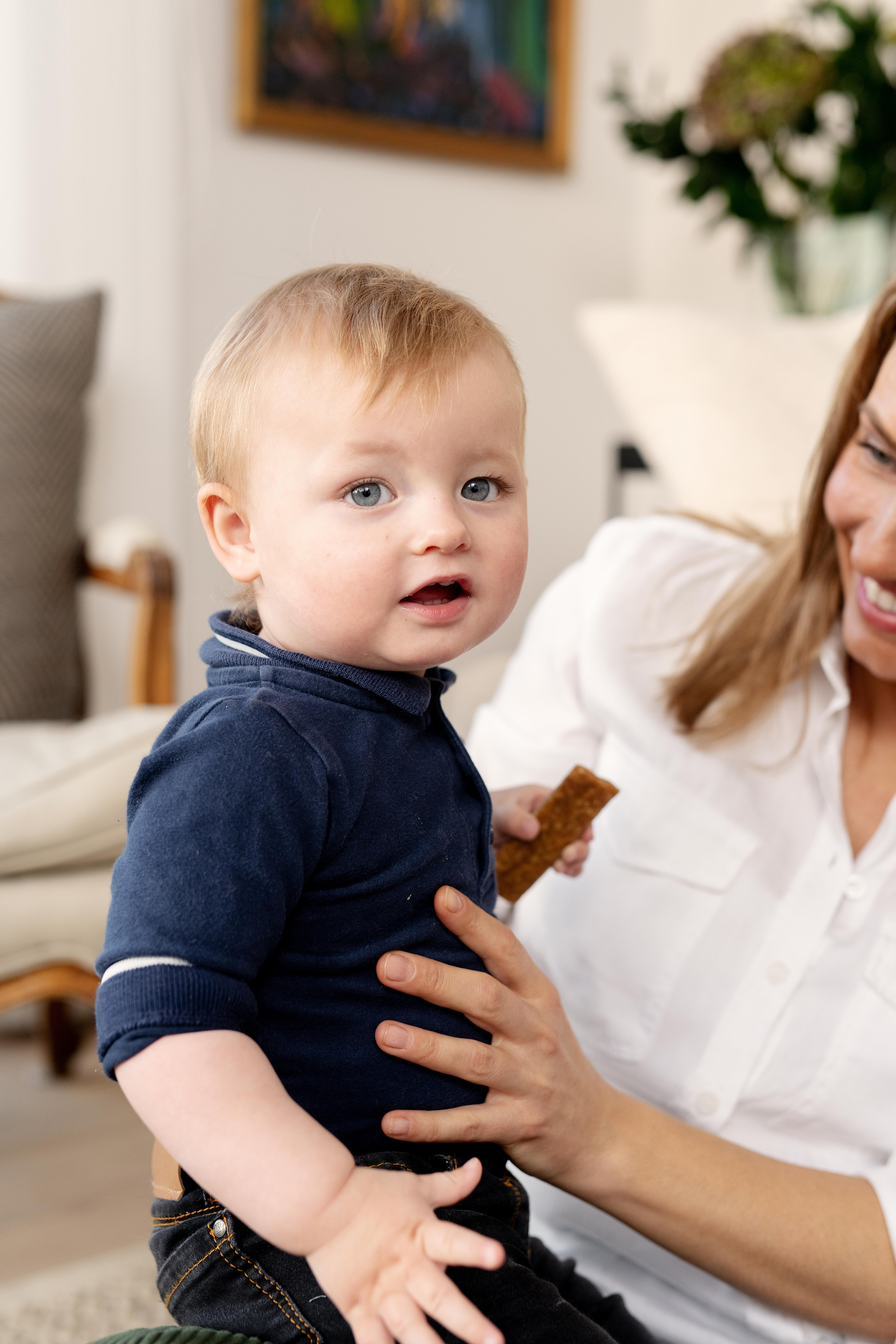
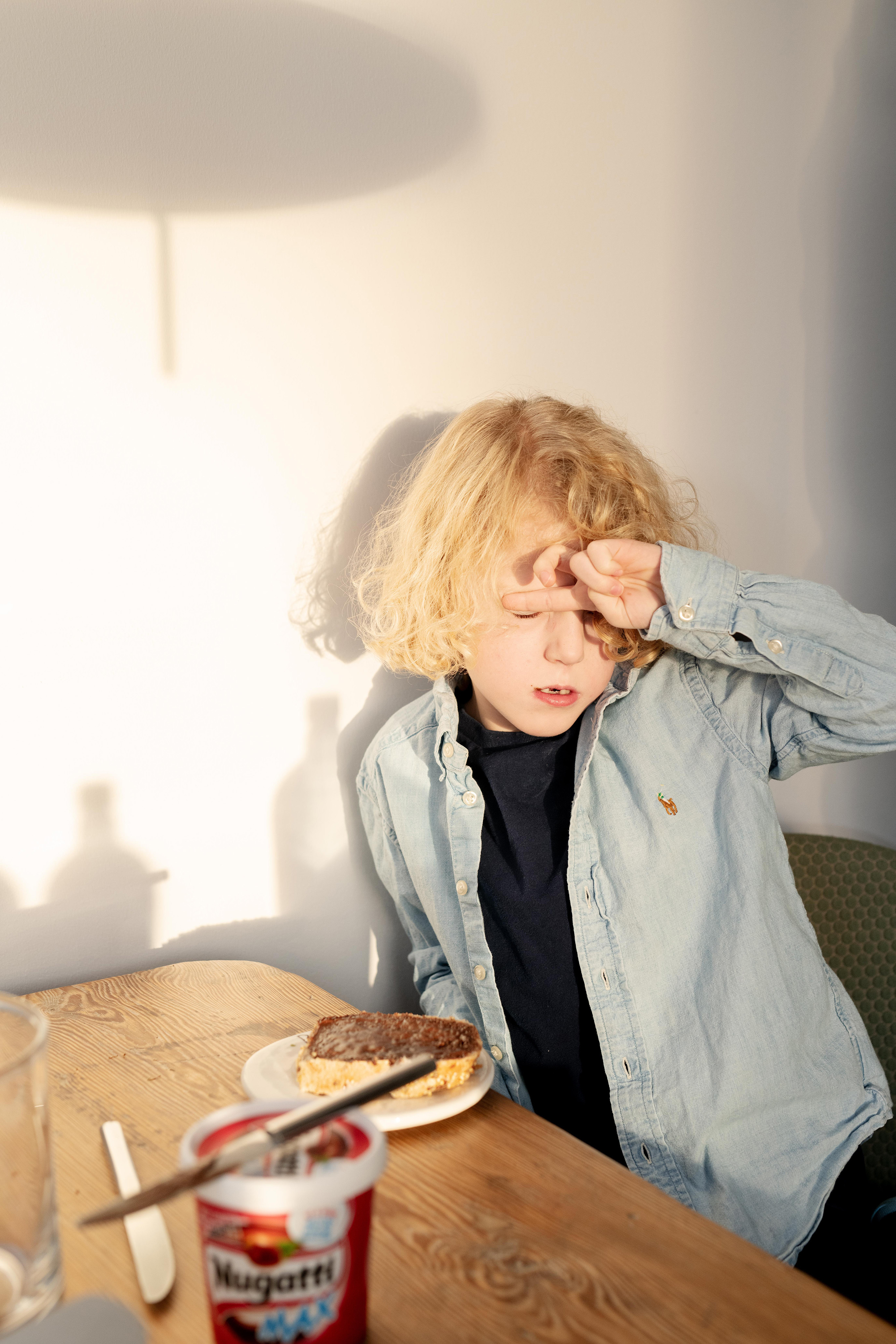
The identity includes over 100 photographs that expresses the love, warmth and honesty Fremtind represents. Shot by Marthe Thu with assistance from Jan Khür and Scandinavian Design Group.

.jpg)

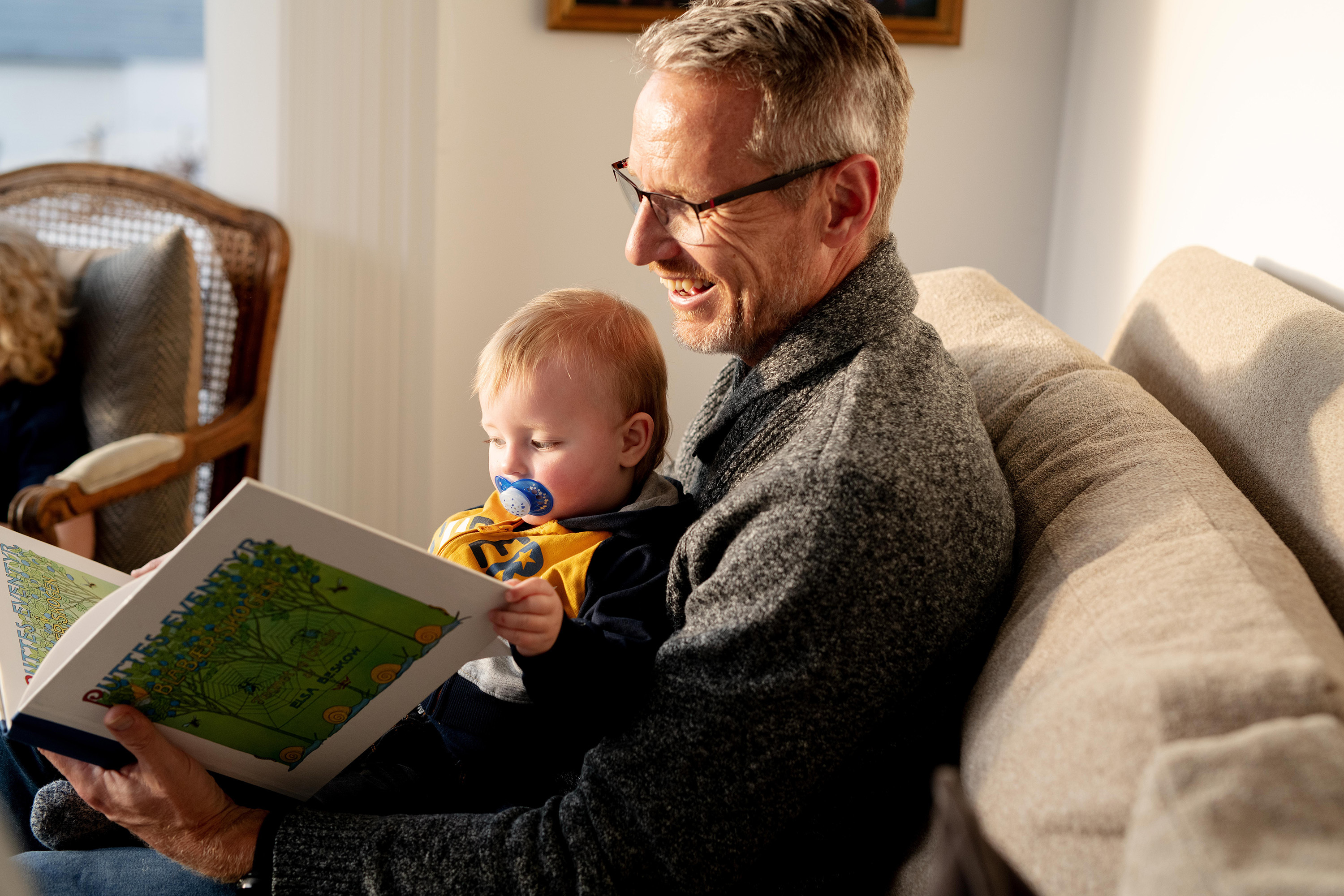
The identity includes over 100 photographs that expresses the love, warmth and honesty Fremtind represents. Shot by Marthe Thu with assistance from Jan Khür and Scandinavian Design Group.
A library consisting of over 60 icons builds on the Fremtind symbol. Used in wayfinding and user interfaces
Fremtind's illustrations are built upon a generative system, using the additional element as a driver to create any composition imaginable
The additional element furthermore represents a protective guardian to conclude Fremtind's identity program
"We wanted a digital identity that can easily adapt in line with technological advances. We also wanted something that stands out as different in our industry. We got just that, and much more. Employees also showed a huge amount of engagement for their new brand." Jarle Moe, Marketing Director at Fremtind